How to Choose Between Alternative Stereo Soufflayer Eye Palette Nude Crema and Skimmed Rose
By URITRIP
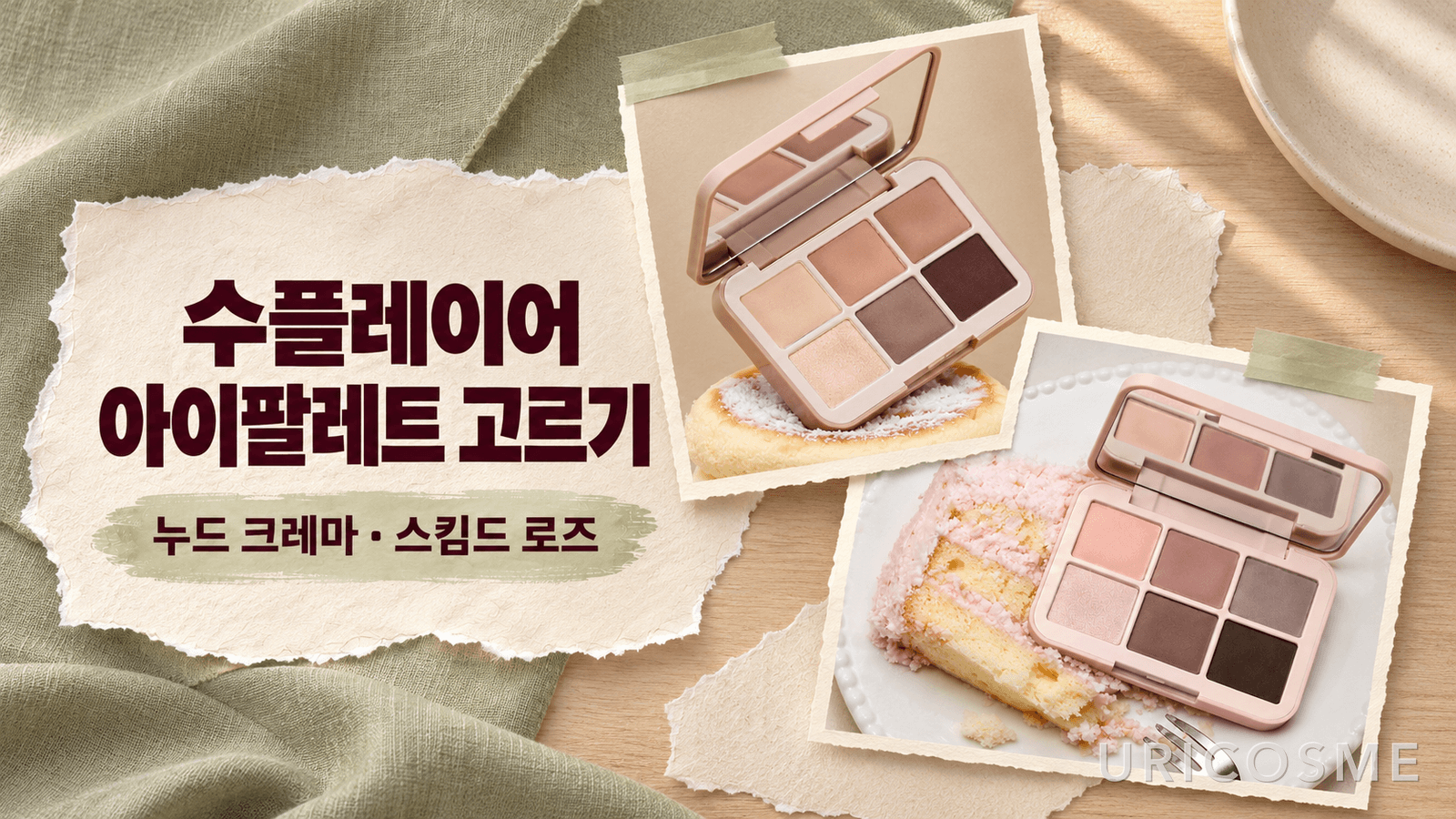
If you already own a beige palette, you may wonder whether another similar one makes sense—or whether switching to rose will make your eyes look too red. When choosing between Alternative Stereo’s Soufflayer Eye Palette in Nude Crema and Skimmed Rose, it makes sense to look first at the midtones you would apply over a larger area, rather than the single prettiest pan. In the product photos, Nude Crema leans toward beige and brown, while Skimmed Rose emphasizes rose and mauve. The useful distinction is less about how dramatic your eyes can look and more about the undertone you want in your everyday shading.
Nude Crema and Skimmed Rose take their midtones in different directions
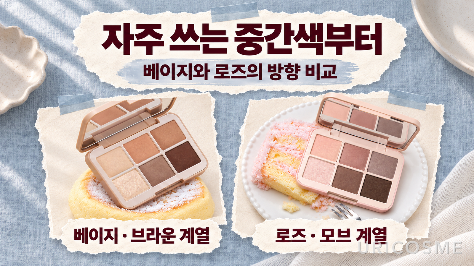
The Nude Crema product photos show light cream, apricot-tinged beige, brown, and deeper defining shades. It is worth considering if you want both a brightening base and colors that add depth in one palette. If you prefer a calm beige or brown look to a wash of pink across your lids, it makes a useful starting point for comparison.
Skimmed Rose draws attention to light rose and muted mauve shades. It could be a candidate when brown alone does not give you the pink-toned mood you want. Still, seeing rose in a photo does not mean every shade will apply as vivid pink. There are deeper shades too, and the finished impression can change with the balance of light shades and midtones you use.
The key here is the medium-depth shade rather than the darkest one, because you are likely to use it over a relatively large area in everyday eye makeup. Liking a deep brown you will use only at the outer corner is a different reason to buy from liking the color you will put on your lids every day. It is reasonable to give the latter more weight.
These color comparisons are based on retailer product photos. Lighting, display settings, and your underlying skin tone can change how colors appear, so this is not a guarantee of individual color payoff or personal color compatibility.
Look at the colors you actually use before warm and cool labels
Assigning Nude Crema to warm undertones and Skimmed Rose to cool undertones would make the decision quick. But that alone does not explain which palette you need more. Someone with warm undertones may like muted rose, while someone with cool undertones may not enjoy wearing pink over a large area. Looking at the mood you want and how you usually apply color is more practical.
Open the palettes you already own and find the shades you have used up most. If you keep reaching for light beige and medium brown, compare how much Nude Crema overlaps with those colors. If you bought a rose shade because it was pretty but hardly touched it, consider when you would use Skimmed Rose this time. A color you never use will not suddenly become an everyday shade just because it comes in new packaging.
On the other hand, if the browns you own have looked too yellow or red on your eyes, you have a clear comparison point. Even shades called brown have different proportions of yellow, red, and gray. Comparing the midtones you use most side by side is more useful than judging the overall mood of a single product photo.
Neither palette is more versatile for everyone. Its value depends on whether you are buying colors you already have or filling a role missing from your collection.
Assign roles to the shades instead of trying to use all six
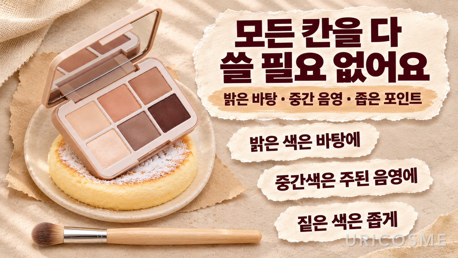
Both product photos show six-pan palettes. There are light shades with visible sparkle and shades at different depths for adding definition, but you do not need to use every color at once. Simply identifying a light base, a main shading color, and a deeper finishing shade makes it easier to plan a look.
For a simple beige-focused look, you could start with a thin layer of light beige and add a medium brown over a smaller area where needed. Using just a little of the darkest shade near the outer corner leaves more room to adjust than spreading it widely from the start. This is a general suggestion based on the roles of colors, not an official application method verified through firsthand use of these products.
The same principle applies to rose shades. Starting with a light base and adding a medium rose or mauve where you want it makes the extent of the pink easier to control. Covering the whole lid with one midtone creates a different mood from using it only on the outer edge. If the color feels intimidating, try a smaller application area before immediately looking for a different palette.
Think about sparkle separately from color depth. Adding reflected light and adding dark definition serve different purposes and call for different amounts. You might want sparkle only at the center of the lid, or almost none at all. Before choosing a palette for its beautiful shimmer pan, check whether the remaining shades can create the everyday look you want.
Distinguish finger swatches from application with your usual tools
If you have a chance to compare the products, do more than one heavy swatch. A thick finger swatch helps show a shade’s color direction, but it does not fully represent the thin layer you would apply with your usual brush. The important difference is how the shades look at the intensity you would actually wear, rather than at their strongest payoff.
Spread the two palettes’ midtones using similar amounts over similar areas. If one is thick and the other sheer, you may notice the amount before the color itself. Assess whether light shades stand apart from your skin, whether midtones create the shading you want, and whether dark shades provide enough definition even in a small area.
It is also important not to infer softness, fallout, or adherence from photos alone. A smooth-looking surface or a soufflé-inspired name does not establish that the texture will feel the same to everyone. Check those qualities separately from the color selection. Consider whether the texture claims highlighted in the product description actually match the conditions that matter to you.
If possible, keep the shades you use most in your existing palette in mind as a reference. This helps you judge whether the new product offers something difficult to achieve with your current colors, rather than simply looking pretty on its own. If the difference is small, there is less reason to rush into buying it.
Consider your blush and lip products to make the choice clearer
If you are considering Nude Crema, think about the beige, apricot, and brown blushes and lip colors you normally wear. It could be easy to connect with a look that follows a similar color direction. You do not need the same intensity everywhere: keep the eyes lightly shaded and add color to the cheeks, or keep the cheeks subtle and give the lips more definition.
Skimmed Rose is easy to imagine in combinations for people who enjoy rose and mauve makeup. Even if you want pink on both eyes and cheeks, you do not need to start with equally intense color in both places. If you have used plenty of rose on the eyes, reduce the area or intensity of your blush. Judge whether the feature you want to emphasize stands out, rather than following a rule about which look is prettier.
If the lip color you plan to wear is vivid, reconsider whether you always need the darkest shade in the palette. The most finished look is not necessarily the one that uses the most colors. If another feature already draws attention, leaving only as much eye shading as you need is a valid choice.
Pan count alone is not how I would compare palette prices either. Even with six shades, if you will only use one or two, it is worth considering other ways to fill those gaps. Conversely, having frequently used roles—from a light base to midtone shading and an accent—in one palette is an advantage. Planning how you will use it before looking at the price gives you a basis for comparing cost.
If choosing just one, fill a real gap in your colors
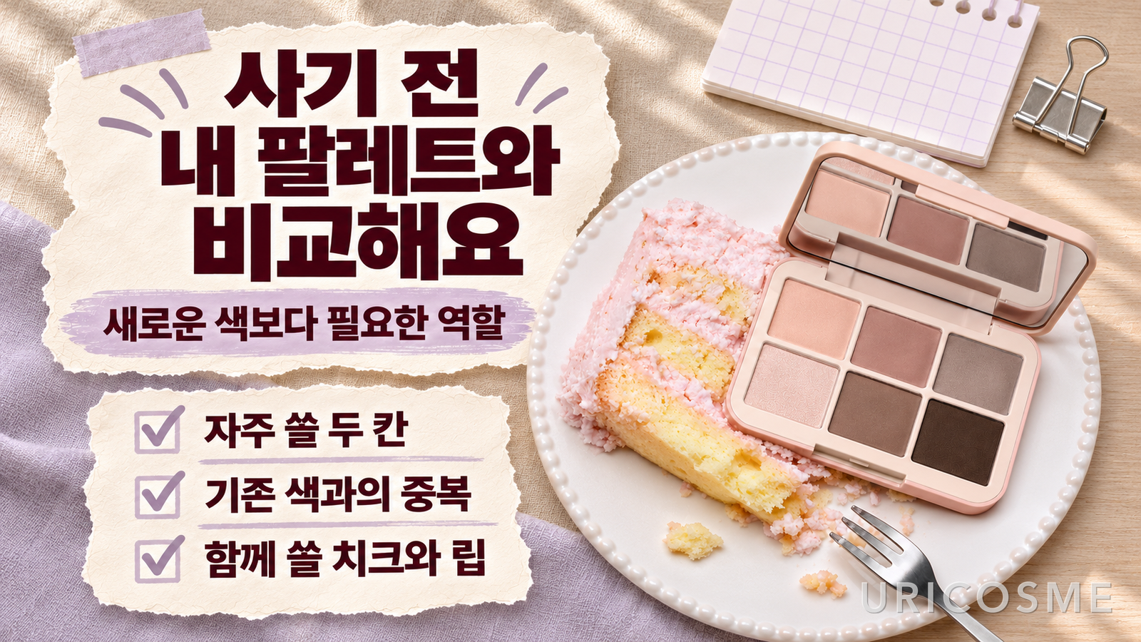
If you cannot decide between Nude Crema and Skimmed Rose, pick just two shades in each that you expect to use often. Check whether you already own those colors, whether you would wear them on weekdays, and whether you have blush and lip products to pair with them. Your reason for buying will become clearer.
Start by comparing Nude Crema if you often wear beige and brown eye makeup and need to replenish those shades. Start with Skimmed Rose if you want your everyday shading to move toward rose and mauve. The most important question is whether you gain colors you will actually use, rather than how many new colors you get. To move beyond simply finding both palettes pretty, decide what role each would play in your makeup.