How to Choose Duty-Free Makeup: Blush, Palettes and Cushions
By URITRIP

Before looking at the discount on duty-free makeup, decide what a new product would add to the makeup you already use. Two beautiful blushes may create almost the same cheek color. A palette bought for its sparkle may be missing the shading colors you need every day. Even a good price does not guarantee that you will reach for a product often.
When several products catch your eye, such as YSL's Peppery Rose and Rose Haze, Prada's Peach and Benefit's Tickle, start by sorting them by purpose rather than name. Do you want more color on the cheeks, more reflected light, or a different texture to work with? Once you know that, your shopping list becomes much clearer.
When comparing blushes, separate color from sheen
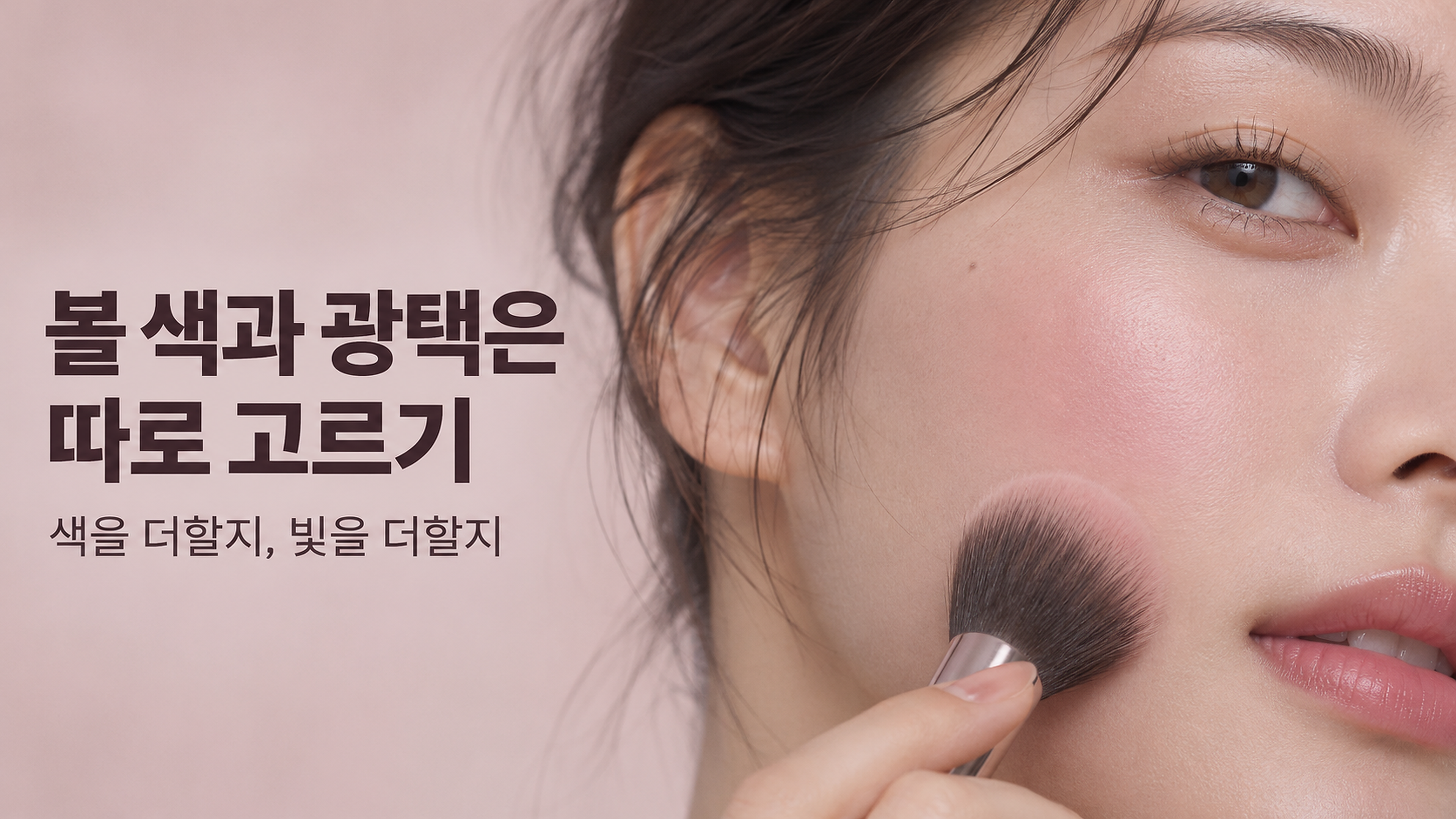
Putting every pink-looking product on the same blush shortlist can make comparisons confusing. YSL Make Me Blush powder blush is designed to add cheek color, while Benefit officially describes Tickle as a golden-pink highlighter. Both can be used around the cheeks, but their main jobs are different.
Think separately about the color you see straight on and the light you notice when you turn your head. You may love a shade but find its shimmer stronger than expected. A color that looks intense in the pan may leave just the right flush when applied sheerly. Saying that pink suits you does not fully explain both effects.
| Product to compare | Its main role | A useful question |
|---|---|---|
| YSL Make Me Blush powder blush, 68 Peppery Rose (Korean shade name) | Adding cheek color with a powder formula | Does it create a noticeably different result from the pink blush you already own? |
| YSL Make Me Blush powder blush, 06 Rose Haze | Comparing another shade in the same range | Would you have a reason to wear each shade on its own? |
| Prada Touch, O86 Peach | Adding coral color with a cream-to-powder texture | Do you want an application method that differs from powder? |
| Benefit Tickle | Adding dimension with a golden-pink sheen | Do you need a different cheek color, or more reflected light? |
The point is not to rank these products. It is to compare what your money would actually change. If you already have a pink blush you enjoy and only want more sheen, a separate highlighter may better suit your goal. If you want to change your cheek color, adding light alone may make less difference than you hoped.
Before buying both Peppery Rose and Rose Haze
When choosing two shades from one range, consider how you would use each one before imagining how pretty they might look layered. YSL's official Korean shade names are 68 Peppery Rose and 06 Rose Haze. Having “Rose” in both names does not make them the same color, nor does it mean they are a pair you need to buy together. Shade names can differ by market, so check the number as well as the name.
If you already like spreading a lighter blush over a wider area and adding a deeper color in the center, you may have a reason to combine two shades. If you usually apply one color quickly each morning, the more practical choice may be whichever one gives you the result you want on its own. A product bought for layering serves a different purpose from one you will wear alone every day.
For a meaningful color comparison, use similar amounts under the same lighting. If one swatch has been rubbed on several times with a finger and the other lightly brushed on, a difference in intensity can look like a difference in shade. A heavy hand swatch can help you identify the color family, but it is not a reliable preview of how much color you will want on the cheeks.
Seasonal color analysis labels can help narrow your shortlist. Rather than drawing a hard line around one season, though, consider the depth of your usual base, your lip color and how vivid you want your cheeks to look. Those details make it easier to build a combination you will actually wear.
With Prada Peach, look at the formula as well as the shade name
The word “Peach” may make you picture a pale, milky peach color. Prada, however, describes O86 Peach in its Touch blush range as a warm, soft coral. A product name is a starting point for imagining a mood; the brand's shade description and presentation help you understand the color you are choosing.
Prada Touch also differs in being a cream-to-powder formula. The brand describes an application that starts like a cream and moves toward a powder-like finish. Even if its color resembles a powder blush, the application experience is different. That can make it worth comparing when you want a new texture rather than simply another shade.
A cream-to-powder label does not, by itself, mean a product will sit smoothly over every cushion foundation. The surface your base leaves behind, how much you apply at once and how firmly you rub all matter. When trying a new combination, start by tapping a small amount onto a small area, then gradually extend it. A change of formula is also a reason to think about your makeup order and tools.
If brushing on powder feels easy and familiar, that routine is a valid selection criterion too. Enjoying a different texture can be a reason to buy something, but deciding whether it will replace your usual product or simply offer an occasional change helps keep expectations realistic.
Choose a palette for the shades that work together, not just its prettiest pan
YSL Couture Mini Clutch shade 100 is Stora Dolls, the shade identified in the Korean product listing. Matching the shade number and name matters, but so does checking whether one palette can complete the eye look you want.
If you are already interested in a CLIO palette such as Scoop of Shade or Napping Cheese, think about which part of your existing collection a new palette would change. Do you want more light base shades, deeper definition, or a different kind of shimmer? Similar-looking colors do not automatically make a purchase redundant, but if the intended use is the same, ask whether the difference is one you need.
If you mainly use a base shade and a medium-depth shadow, those two colors deserve the most attention. If you prefer a deeper smoky eye, consider whether the palette provides both a dark shade for the outer corners and the shimmer you want to layer over it. Buying for one dazzling pan may leave you reaching for another palette every time you need definition.
A dense finger swatch can also look different from color brushed over a larger area. Strong pigmentation is not always better: someone who likes to build up thin layers has different needs from someone who wants bold color in one pass. More useful than counting pans is asking whether the color selection can complete a look you wear often.
Do not translate Prada cushion shade LC5 into another brand's numbering

Prada's official Japanese store describes Mesh Cushion shade LC5 as a light shade with a cool base. That helps explain its direction, but it does not mean it is an exact match for shades 17 or 21 from Korean brands. Treating two brands' shade numbers as a shared scale can lead to the wrong choice.
It helps to separate depth from undertone when choosing a cushion. Depth is about how light the product looks against your face and neck; undertone is the direction of the color, such as pink or yellow. A shade can look wrong even at the right depth, and an undertone you like can still look disconnected from your neck if the foundation is too light.
The wrist and back of the hand are convenient comparison points, but they cannot fully stand in for your face. A thin layer near the jawline, using the amount you would normally wear, gives you a more relevant view of the transition between face and neck. Compare two options with the same amount under the same lighting, both immediately after application and after some time has passed. This is a way to compare the finish that remains, not a claim that every foundation necessarily turns darker.
Think about hydration and coverage separately too. An initially moisturizing feel does not tell you everything about shine, patchiness or transfer over the day. Bringing your usual skincare and powder routine into the comparison makes it easier to picture real use than relying only on a brief “for dry skin” or “for oily skin” label.
Why it helps to change your RMK base and cushion one at a time
RMK officially describes Make Up Base as a lightweight, emulsion-like makeup primer. Its role is to prepare the skin's surface so foundation sits well. Decide first whether you want a smoother-looking finish or better adherence from this step; that makes it easier to see whether you have a reason to buy it along with a new cushion.
If you replace both your primer and cushion at once, even a result you love will not tell you which product made the difference. If your base becomes patchy, it is also harder to separate the product combination from the amount used or your skincare. Trying the new cushion over a familiar primer first, then changing only the primer, makes the source of a difference easier to compare.
Compare duty-free prices on an equivalent basis as well. A foundation on its own, a set with a refill and a different product size cannot be compared by the headline price alone. For a Korean duty-free purchase, start with the final amount payable in Korean won and the included items; when comparing other currencies, use the same currency for both totals. Then consider whether you will actually use the refill or the included shade. Buying just the one product you need can sometimes reduce your total spend more than buying a larger discounted set.
The value of new makeup shows up in how you use it, rather than how many products you buy. For an everyday cheek color, look for a blush you enjoy on its own. If you lack sheen, consider a highlighter. If you need a cushion, start with a shade that works across your face and neck. Being able to describe when and why you would use each item in one sentence makes your reasons for buying much clearer.
Check the CLIO palette option at OLIVE YOUNG Global
This section contains an affiliate link. We may earn a commission from qualifying purchases through our OLIVE YOUNG Global link.
This is a regular online retail link, not a duty-free offer. The store currently lists a Napping Cheese set under Pro Eye Palette Air. Check the full product title, palette layout and included items before buying; a familiar shade name does not establish that every edition is identical.
CLIO · Napping Cheese set (current store listing)
Select [SET] 019 Napping Cheese (+Single Shadow). The current store page is titled CLIO Pro Eye Palette Air; confirm that the version and set are the ones you want.
View CLIO · Napping Cheese set (current store listing) at OLIVE YOUNG Global
Our OLIVE YOUNG code is URICOSME1, subject to the retailer's current terms. Shade ranges, versions and sets vary by retailer. Check current stock and delivery eligibility for your destination.