Where to put blush: a 5-second test by face shape
By URITRIP
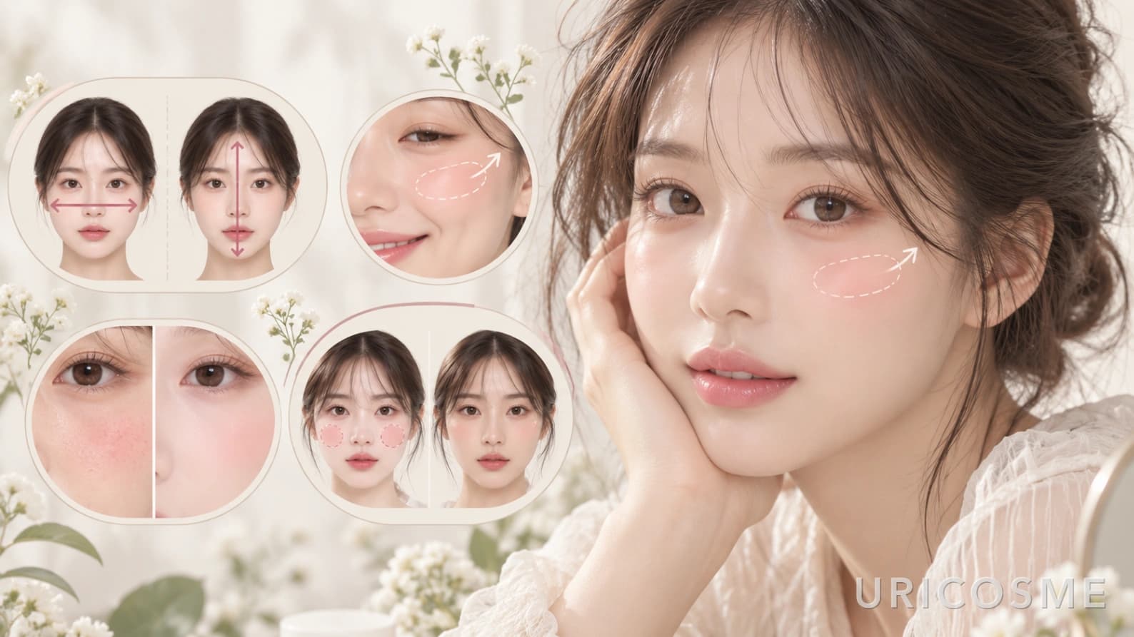
Blush placement changes the face as much as the shade does. The same pink reads soft and youthful when it sits in a round patch on the apples of the cheeks, and longer and more defined when it starts on the upper cheekbone and lifts toward the temple.
Rather than sorting faces into a dozen shapes, this test walks through four checks in order: the width-to-length ratio of the face, how the cheekbones behave when smiling, where natural flush shows up, and the impression the wearer wants. Five seconds in front of a mirror settles the starting point.
Makeup artists tend to work the same way, adjusting placement for the effect they want rather than for the face shape alone. High placement reads as lifted, while blush on the apples reads soft and young.
The short version
A wide face takes blush higher, a long face takes it more horizontal. Prominent cheekbones call for blending away from the highest point. For a cute, soft look, use the apples; for a polished, grown-up look, use the top of the cheekbone.
How to run the blush placement test
- Look straight into a mirror and judge, using the line under the eyes as a guide, whether the face reads wider than it is long or longer than it is wide.
- Smile fully and check whether the cheekbone shape stands out clearly or whether the cheeks round up and hide the bone.
- On bare skin before base makeup, note where natural redness usually appears on the cheeks.
- Decide between a cute, soft impression and a polished, grown-up one.
- Combine the four answers and find the matching result under "Placement by test result" below.
- Apply apple-centered blush on one cheek and high-placement blush on the other, then compare in the mirror and in a photo before settling on a position.
The four questions that decide placement
The test has four questions. Picking A or B for each one gives everything needed to choose a placement.
| Question | A | B | Effect on placement |
|---|---|---|---|
| Q1. Face proportions | Wider | Longer | Wide faces do well with blush high and outward; long faces with blush centered and horizontal |
| Q2. Cheekbones when smiling | Cheekbones stand out | Cheeks round up, bone less visible | Strong cheekbones call for shifting color away from the center of the bone |
| Q3. Natural flush | Yes | No | The natural flush zone becomes a reference point |
| Q4. Desired look | Cute | Polished | Cute suits the apples, polished suits high placement |
The principle is simple: blush fills in whichever direction the face seems to lack.
Q1. Is the face wider or longer?
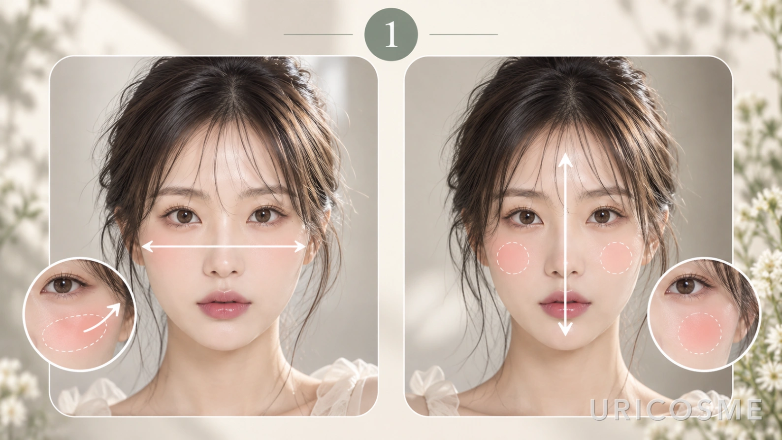
The first check is overall proportion. If the width across the cheeks under the eyes is what stands out, the answer is A. If the length from forehead to chin dominates, the answer is B.
For a wider face
On a round face or one with noticeable width, a round patch of blush in the center of the cheek makes the cheeks look wider still. Diagonal blending from the upper cheekbone toward the temple works better.
Maybelline's guide for round faces keeps the pigment above the tops of the cheekbones and blends upward toward the temples, noting that drifting onto the apples emphasizes fullness. L'Oréal Paris gives the same direction: higher placement pulls the eye up and makes the face look longer and more sculpted.
Suggested placement
Center of the cheekbone → outward → temple
The key is a slight upward angle rather than a flat horizontal sweep toward the ear.
For a longer face
A long face does not need to commit to a high diagonal. Placing blush on the center of the cheek and diffusing it sideways emphasizes horizontal lines over vertical ones, and the proportions settle.
L'Oréal Paris recommends applying blush more horizontally across the apples on long faces, blending outward rather than sharply upward, since angling toward the temples exaggerates length.
Suggested placement
Center of the cheek below the pupil → a short, near-horizontal sweep toward the ear
Stopping slightly above the level of the nose tip looks more natural than dragging the color lower.
Q2. How much do the cheekbones show when smiling?
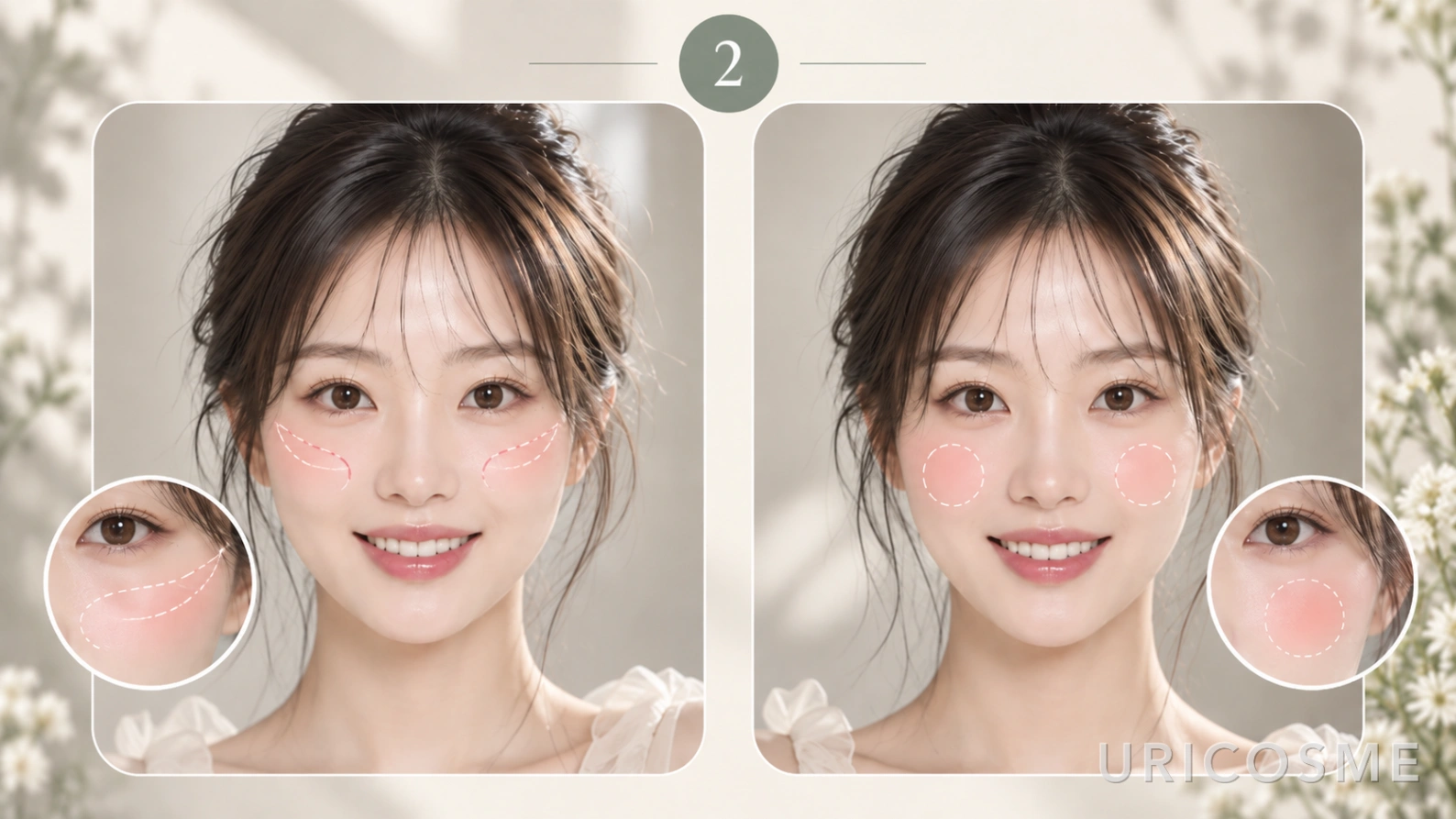
The second check is how the cheeks move in a smile. There are two types.
Type A
The cheekbone shape shows fairly clearly when smiling
Type B
The cheeks round up and the bone itself is not emphasized
This matters because blush can add to volume that is already there.
Prominent cheekbones
When the cheekbones are already defined, saturating the entire highest point makes the structure look heavier than intended. Keeping the color thin and centered slightly inward or above the peak of the bone works better.
Cheeks that round up
When the cheeks lift softly, blush on the center of the cheek looks natural. Color on the apples is the classic way to brighten and soften the face.
Q3. Where does natural flush show up?
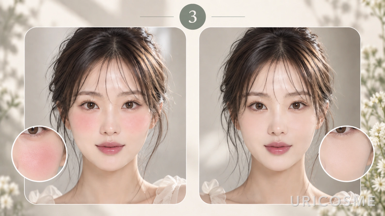
The third check is redness. For those whose cheeks flush easily, the area that reddens naturally is a useful reference for where color looks believable on that particular face.
That does not mean covering the whole flush zone with blush. If redness remains after base makeup, the two stack and the color reads too strong.
In that case, evening out the redness with base first and then adding a small amount of blush gives a calmer result. Makeup artists generally recommend settling the base before blush for the same reason: uneven redness makes blush look patchy.
Q4. Cute and polished looks sit in different places
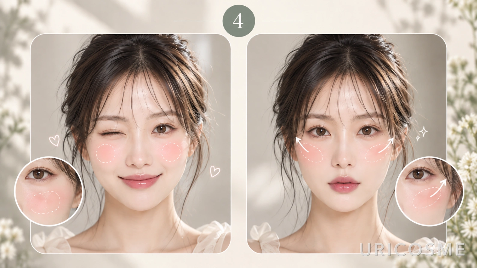
The last question is not about bone structure but about mood, and it carries a lot of weight in practice.
Cute and soft
This places the color on the apples, the part of the cheek that rises highest in a smile. Rather than a large circle, a small area blended softly works best.
Suggested placement
Center of the cheek, below the pupil, one to two finger-widths from the nose, diffused in a round shape
Concentrating color in the middle of the face draws the eye to the center, which reads younger and softer.
Polished and defined
This follows the upper line of the cheekbone outward.
Suggested placement
Start at the highest point of the cheekbone below the outer corner of the eye and blend diagonally toward the temple
High-placement blush is one of the defining techniques of 2026. Makeup artists quoted by Bustle describe it as color stretched upward across the cheekbones and blended toward the temples instead of sitting on the apples, lifting the face without heavy contour.
Placement by test result
Applied to actual makeup, the four questions collapse into four results.
1. Wide face + cute look
A wide face does better without blush spread far to the sides. Start at the center of the cheek and lift only the tail end slightly upward.
Suggested placement
Center of the cheek → upper cheekbone
This keeps the soft mood while limiting extra width.
2. Wide face + polished look
This is the combination where high placement is the clearest fit. Center the color on the top of the cheekbone rather than the apples and carry it toward the temple.
Suggested placement
Top of the cheekbone → temple
It is the standard way to make a round or wide face read longer and more defined.
3. Long face + cute look
On a long face, spreading the color horizontally from the center of the cheek works better than dragging it upward.
Suggested placement
Below the pupil → center of the cheek → a short sweep sideways
Keeping the color from traveling downward is the priority.
4. Long face + polished look
A long face does not have to stay centered. Bring the color up to the top of the cheekbone but stop at mid-height with a short diagonal instead of running it to the temple.
Suggested placement
Slightly above the center of the cheek → toward the outer corner of the eye
This adds polish without adding apparent length.
Adjusting for prominent cheekbones
On a face with strong cheekbones, the priority is a soft edge rather than heavy color on the entire peak of the bone. Loading a brush and pressing it straight onto the skin concentrates pigment in one spot.
Working the product into the brush or sponge first, then placing it with a clear darkest point and lightest point, looks more natural. Patrick Ta recommends stamping blush into the skin rather than swiping, then building in light layers.
How placement changes the impression
| Placement | Effect | Best for |
|---|---|---|
| Apples of the cheeks | Younger, softer | Long faces, cute looks |
| Top of the cheekbone | Face appears lifted | Round faces, polished looks |
| Toward the temple | Sharper, more refined | Wide faces |
| Horizontal sweep | Softens vertical length | Long faces |
| High under the eye | Connects the upper face and cheek | Current high-placement styles |
Connecting the area just under the eye to the top of the cheekbone pulls attention upward and gives a lifted effect, which is the logic behind the high-placement and draping styles seen this year.
Formulas that suit each placement
Once the placement is set, the formula follows. Powder is easiest for a small, defined patch on the apples, while creams and liquids are easier to diffuse over the wider area that high placement and under-eye blush cover. Testers at Sephora or Ulta make it simple to try a different placement on each cheek before buying.
| Placement | Easiest formula | Examples |
|---|---|---|
| Apples of the cheeks | Powder with a small brush | Patrick Ta Major Headlines Double-Take Crème & Powder Blush Duo (powder side), Rom&nd Better Than Cheek |
| Top of the cheekbone → temple | Sheer cream or liquid, one dot at a time | Rare Beauty Soft Pinch Liquid Blush, Glossier Cloud Paint |
| Under-eye and draping | Jelly or cream blended with fingers | Milk Makeup Cooling Water Jelly Tint |
K-beauty powders such as Rom&nd are stocked at Olive Young Global and Amazon in the US. Shade ranges change by season, so the current lineup is worth checking on the retailer's site before ordering.
Four ways to avoid blush mistakes
- Never start heavy. With powder, load the brush, tap off the excess, make the first point of contact the darkest, and diffuse outward from there.
- With cream or liquid, dispense onto the back of the hand first to control the amount, then build in thin layers.
- Check the face from the front, at 45 degrees, and in profile. Blush that looks fine head-on can run all the way to the ear from the side.
- When in doubt, apply apple-centered blush on one cheek and high placement on the other, then compare in the mirror and in a photo.
Frequently asked questions
Should blush placement be decided by face shape?
Face-shape guides are a useful starting point, not the deciding factor. Makeup artists adjust for the mood someone wants and for that person's actual bone structure. Setting the direction first, higher for wide faces and more horizontal for long ones, and then choosing the final spot by the desired impression works well.
Where does blush go on a round face?
Diagonal blending from the upper cheekbone toward the temple, rather than the center of the cheek, suits a round face. It pulls the eye upward so the face reads longer and more defined. For a softer look, start at the center of the cheek and lift only the tail end.
Should a long face avoid high-placement blush?
Not entirely. A short, near-horizontal sweep from the center of the cheek below the pupil toward the ear emphasizes width and balances the proportions. For a more polished look, a short diagonal that stops at mid-height is an option.
Can blush be skipped on cheeks that flush naturally?
The flush zone is a good reference for where color looks natural, but stacking blush directly on top makes it too strong. Evening out the redness with base first and then adding a small amount gives a calmer finish.
The answer is the impression, not the face shape
Summed up: a wide face takes blush higher, a long face takes it horizontal, and prominent cheekbones call for blending away from the highest point. From there, the apples deliver a cute look and the top of the cheekbone delivers a polished one.
Face-shape formulas are guidelines rather than fixed rules. Makeup artists treat them as a starting point and adjust for the mood someone wants and the structure of that particular face.
The simplest check is to apply apple-centered blush on one cheek and high placement on the other, then compare in the mirror and in a photo. Whichever side looks most balanced and at ease is the right blush placement for that face.