3 Daiso Korea Makeup Picks and How to Choose the Right Shades
By URITRIP
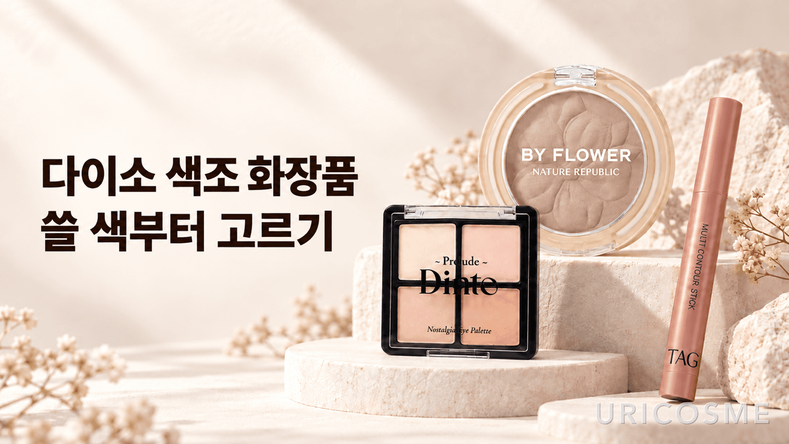
If you’re looking for makeup at Daiso in South Korea, start with the part of your routine you want to fill. For soft, everyday eye makeup, consider Dinto’s Little Alcott palette. For definition around the face, look at By Flower Cotton Shading. If you want a rosy shade that connects your lips and cheeks, TAG’s Nude Rosy is worth a closer look. The prices are similar, but each product does a different job.
The useful question is less about how closely a product resembles a luxury alternative and more about whether it contains shades and serves a purpose you’ll actually use. A low price can make an impulse buy feel harmless. But if the color duplicates something you own, or a palette is missing the shade you need to finish your look, it may not be such a good purchase after all.
Check the shade name as well as the brand. This matters especially with products labeled “contour”: different shades in the same range can be intended for quite different uses.
| Product and shade | Listed price on Daiso Korea’s online store | Item number | What to consider it for |
|---|---|---|---|
| Prelude Dinto Nostalgia Eye Palette, 71 Little Alcott | ₩5,000 | 1061145 | A light base and soft eye definition |
| By Flower Cotton Shading by Nature Republic, Cymbidium Medium | ₩3,000 | 1083576 | Adding shadow and definition to the face |
| TAG Multi Contour Stick, Nude Rosy | ₩3,000 | 1045429 | A rosy touch around the lips and on the cheeks |
These are the Korean store’s listed prices in Korean won. Recheck prices and purchase conditions before ordering. Availability can also differ between the online store and individual branches.
Dinto Little Alcott: look for the shades your everyday eye makeup needs
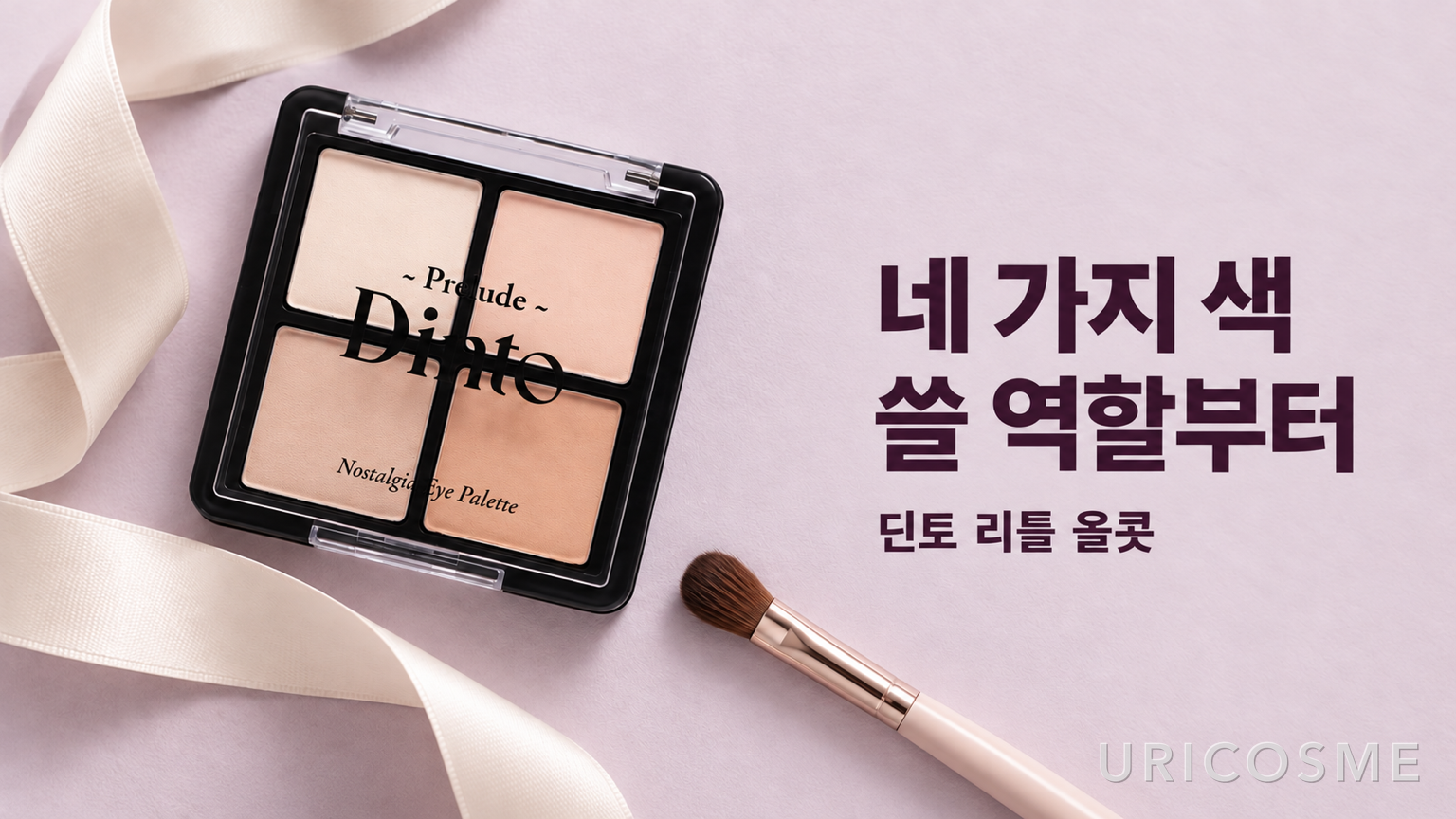
Little Alcott is a four-shade eye palette. The product images show a light ivory tone, soft pink and beige shades, and a relatively deeper shade. It’s a combination to consider for a light, understated eye look rather than one built around black or very dark brown.
Counting the shades only tells you so much. A color swept over the whole lid, a shade used to add a little depth, and a darker color placed close to the lashes each have a different role. You might like all four colors, but if one of the steps you need is missing, you’ll still have to reach for another product.
That difference in depth is also the basis of a simple eyeshadow routine: start with a shade close to your skin tone, add a deeper shade where you want definition, and soften the edges. With Little Alcott, thinking in terms of the lightest and mid-tone shades can help you plan a look. You don’t have to use all four at once. If you mainly need a light base and one slightly deeper color, a small palette can make the choice easier.
If you want one palette to give you a crisp finish along the lash line as well, check how dark its deepest shade actually is. This combination makes more sense for soft transitions than for a very dark finishing shade. You can pair it with an eyeliner or a deep brown shadow you already own, but it may leave a gap if you expect it to handle every step on its own.
A palette with several light shades is not automatically a palette with weak color payoff. The depth of a color and how strongly it applies are different things. A shade may look subtle when it’s close to your skin tone, while the same light color may stand out on a different base. Rather than relying only on “warm” or “cool” labels, compare it with the base shadows you already use and ask whether it gives you the lightness you want.
By Flower shading: judge the blended shadow, not the initial intensity
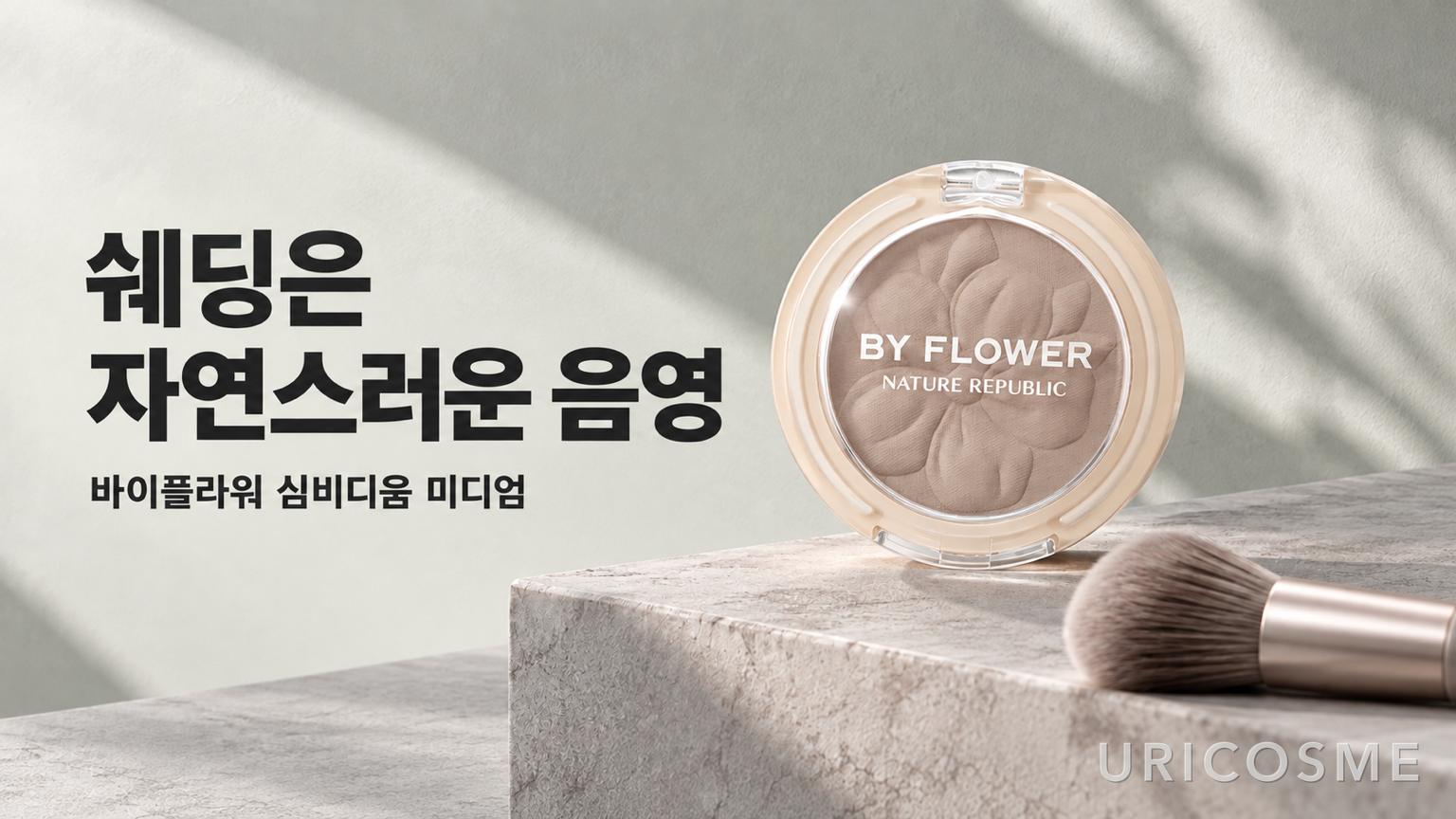
By Flower Cotton Shading in Cymbidium Medium is classified in the official product information as matte and neutral-toned. The range also includes Cymbidium Light. Before choosing Medium simply because it appears in a recommendation, compare the two shades against your skin and the kind of definition you want.
For a contour powder, the important question isn’t how dark it looks in a single swipe. It’s whether it blends into something that resembles a natural shadow on your face. Strong color alone doesn’t make a good contour, and a subtle result doesn’t make a product useless. If the first thing you notice when looking straight ahead is a brown line rather than a more defined shape, the effect may be missing the mark.
It helps to separate the purpose of bronzer from that of contour. Bronzer generally adds a warm, sun-kissed effect; contour uses shadow to suggest definition. If a natural shadow is your goal, look beyond whether a warm brown is attractive in the pan and consider how it blends with your skin. This doesn’t mean every shade with warmth or redness is a bad choice. A different effect can call for a different color.
Choosing between Medium and Light also takes more than the rule “fair skin means Light.” Think about where you want to apply it, how much definition you want, and how comfortable you are controlling the amount on your brush. For a first purchase, a shade that isn’t dramatically deeper than your skin may be easier to work with. If your current light contour never gives you enough depth, there’s a reason to compare Medium.
When you can, look at a swatch after its edges have been blended, not just as a heavy stripe. A shade that stands out on the back of your hand isn’t necessarily one that looks natural on your face. Different lighting can also change how it appears, so checking it in more than one setting can help. The official “neutral” classification is a starting point, not a guarantee that it will blend naturally with every skin tone.
TAG Nude Rosy: think lips and cheeks rather than facial contour
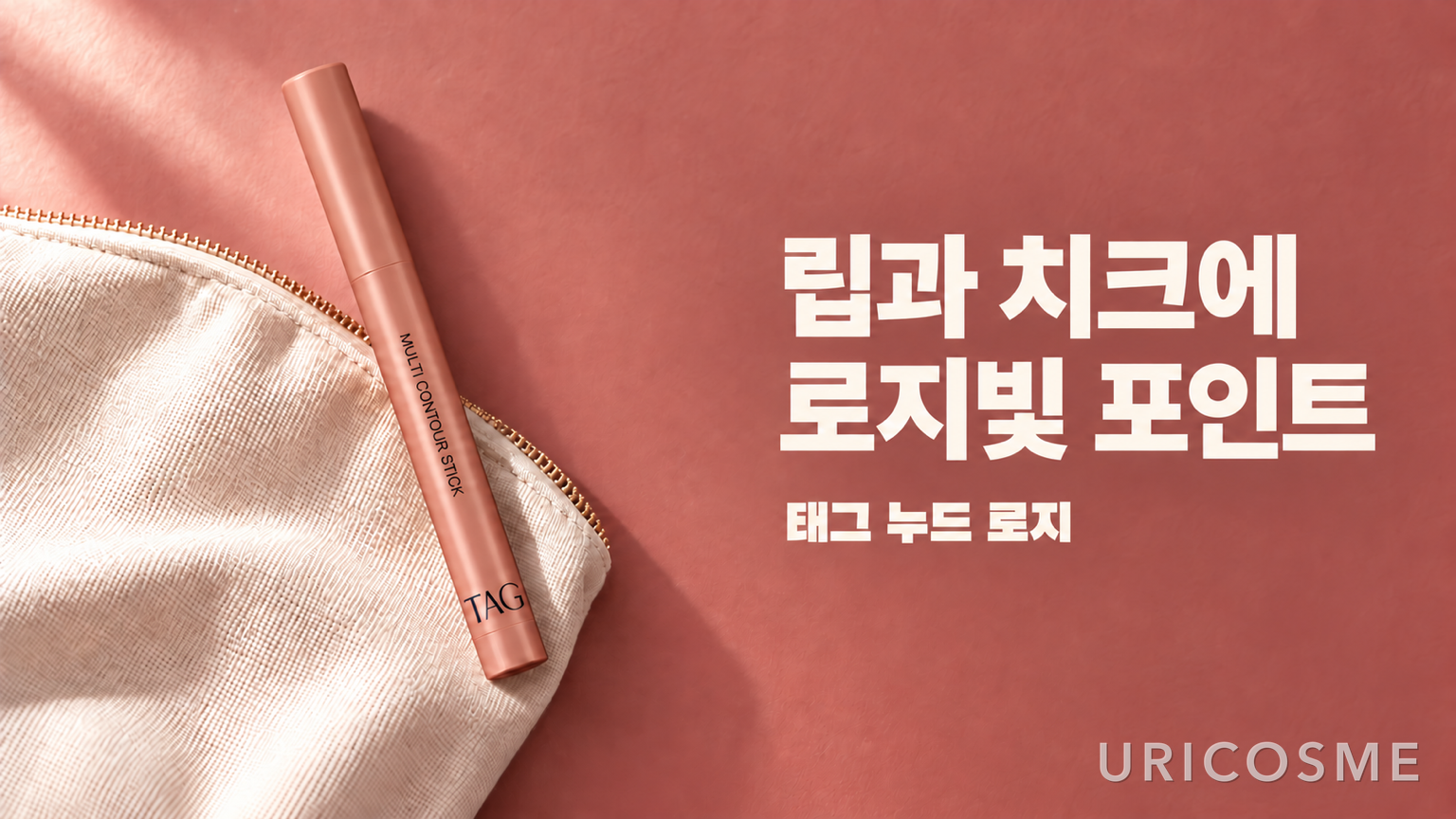
The name TAG Multi Contour Stick may bring nose or jaw contouring to mind. But the official description presents Nude Rosy as a shade for overlining the lips and adding color to the cheeks. It’s more accurate to think of it as a rosy stick for the lip area and cheeks than to expect a gray-brown sculpting shade.
Its appeal isn’t simply that it can be used in more than one place. It’s that one color can tie your lips and cheeks together. If choosing separate lip and blush shades feels difficult, that can simplify the combination. If you prefer muted cheeks and a bold lip, however, using one shade for both may not suit your routine.
For overlining, distinguish between the shade you use to fill your lips and one you use to softly refine their edges. The question is whether Nude Rosy connects naturally with your usual lip color. A large difference between the edge shade and the color in the center can make the boundary more noticeable, so consider the pairing rather than the stick on its own.
Instead of drawing a thick outline well beyond your lips in one pass, you could start by adding a little where you want more definition and softening the edge. The product is described as having a built-in sharpener, which lets you reshape the tip for this kind of use. That feature doesn’t tell you how smoothly the formula applies or how much it smudges, though. A useful detail isn’t enough to establish overall performance.
On the cheeks, you’re also blending across a larger area than around the lips. A shade you like at the lip line may look stronger or softer than you want on the cheeks, and the base makeup underneath can change the result. Rather than requiring the product to be equally satisfying for both jobs, start with the one area where you need it most. Being suitable for two uses and being your favorite for both are different things.
Instead of looking for a luxury dupe, compare the performance you need
When browsing affordable Daiso makeup, it’s natural to wonder whether it can replace something more expensive. But similar colors and identical results are two different claims. Even if two palettes have a similar color story, that doesn’t establish that they blend or wear in the same way.
There’s no need to assume lower quality just because the price is low. Equally, there isn’t enough evidence here to call these products performance equivalents of particular luxury items. Shade selection and official uses alone can’t establish adherence, wear time, or whether a formula applies patchily. Separating what the product listing tells you from what requires actual wear testing makes for a more useful buying decision.
The comparison becomes easier once you narrow down the performance you need. For the Dinto palette, start with whether it contains the right shade depths. For By Flower, consider whether the blended color gives you the shadow you want. For TAG, ask whether the color and format fit the area where you plan to use it. If long wear is essential, look for wear-time information separately. Comparing prices without a clear purpose can leave the original problem in your routine unresolved.
Before buying all three, check what’s already in your makeup bag
The three listed product prices add up to ₩11,000. That isn’t a checkout total including shipping, and it doesn’t mean you need to buy them as a set. A low price per item is appealing, but adding products you don’t need can increase how much you buy rather than how much you save.
Before shopping, identify one specific gap in what you use now. Do you always finish the lightest shade in your palette first? Does your contour look unlike the shadow you want? Are you missing a color that connects the edges of your lips with your usual lipstick? Each situation calls for a different addition. If you already have enough colors that do the same job, skipping a purchase is a perfectly reasonable choice.
In store or on a product page, check the shade name and item number together rather than skimming the long product name. This is especially useful when you want a specific palette shade such as Little Alcott, or when shades within a line have different intended uses, as with TAG. Choosing a similarly named shade because the one you want is out of stock may keep the price the same while changing what you’re buying it for.
One advantage of affordable makeup is the chance to explore an unfamiliar color or format for a relatively small amount. Making the most of that opportunity doesn’t mean filling your basket. Ask whether the product fills one gap that what you already own cannot, and start with the one that gives you a clear answer.